Video
One Block. Multiple Stories. Generational Impact.
That was the challenge when HDF approached our team to create a video for its Annual Breakfast. The goal was not…

So you’ve been driving traffic to your website. Way to GO! You’ve done your due diligence with online advertising, SEO, influencer marketing, brand building, social media - you’re basically a pro by now. While these methods can steadily improve website traffic, focusing too heavily on traffic numbers is only part of the strategy. Effective digital marketing should go beyond views and influence site visitors to click that Call-To-Action button.
If your site is gaining traffic, but not converting leads, then where is the disconnect? Where are you losing people? How can you increase your conversions? Let's figure it out.
You know your company well, but your users may not. Within seconds, your site visitors should understand what you do, and what your website is about. Successful companies do this well and know that people will abandon their site if it requires too much thought or causes any confusion. Take the guesswork out of the equation. Place clear and meaningful headline copy in a highly visible spot on the home page or landing page. Once your users know what you do, then you can start guiding them through other details, products, services, promotions or other content further into the site.
For example, check out the Taxcloud site. It’s immediately clear what they do (sales tax compliance) and provides a path for the user (get started).
Concise. Understandable. Easy to digest.

Throughout the site, make sure to implement user-friendly copy in your overall messaging system that avoids too much jargon or slang. Use visuals that are relevant and connect with your audience. These tactics can help users understand quickly what your site does and more importantly, what your company can do for them. A good website does more than just speak about the company – it answers the user’s question “What’s in it for me?”
Key Takeaway: You understand your business, but your users may not. Make it easy for them.
People don’t really “read” on a website, they scan for things that are important to them. Long, dense paragraphs are overwhelming and can intimidate users.
If your pages are a wall of text, this can come off as too much of a commitment, and users may move on. Separate content into smaller chunks of information that’s easier to digest, and make ample use of subheadings and bulleted lists. Keep your pages digestible, maintaining a variety of layouts and a balance of imagery to break things up for the eye.
Reserve longer text for appropriate deep-dive pages when the user is engaged at a certain level or really looking for those details, which will be further down the funnel.
Key Takeaway: Shorter chunks of content are easier to scan and more digestible for users.
Your navigation sets the stage for how users will explore the site and find what they are looking for. If it doesn’t make sense to users, they are unlikely to continue down the funnel to conversion.
You must simplify. This is crucial. It may sound obvious, but it’s often overlooked. Prioritize what’s essential and core to the primary goals of the site, and keep the number of menu tabs to a minimum. The more items there are, the more this dilutes the primary goal. Too many choices can overwhelm users and can actually hurt conversion. Keeping the navigation focused will increase the chance for users to stay on the path to conversion.
Categorize. Evaluate if pages or categories can be consolidated under a second tier or subnavigation. Even sites with dense navigation can successfully keep the top level menu minimal. Take a look at houzz.com for example. Categorization is used to bucket different types of content to emphasize relationships between sections and help users understand their choices. Seriously, categories for the win.

Lastly, use terms that are commonly understood, even if they don’t sound as unique or catchy. Users need familiarity, and there are conventions in place for a reason – people understand them! For example, when people see the word “Contact” or “About”, they know what to expect. There is no guesswork involved. If they need to make an effort to understand what a navigation term means, they’re less likely to click on it.
Key Takeaway: Simplify, categorize, and stick with familiar language.
Good design instills confidence in users. Users need to know you are a dependable business that they should engage with, and people will form an impression within seconds. Don’t underestimate the power of a professional and well-designed website. Aesthetics, color and design choices play a pivotal role in how users will judge your company and brand. You must prove that you are more than a fly-by-night company that threw together a website. An inviting, professional website can give users a sense of comfort with your business. Poor design will lose the credibility, integrity, and trust of users, making them quick to abandon the site.
Stay consistent. Your business should have a clear brand and stick to your branding guidelines throughout the site. Every page and section of your website should follow the same theme, and users should never question if they are still on your site or somewhere else. Keeping consistent elements across pages will strengthen your brand presence.
Utilize social proof and substance. People want to know that they are working with a company that has a proven record of success. Adding testimonials or case studies to your site builds trust and credibility.
Key Takeaway: Good design is good for business.
Your call-to-action is one of the most critical pieces of a successful website. It is the gateway to conversion. A call-to-action is a prompt that tells the user to take a specific action, such as “Contact Us”.
A well-designed call-to-action should command attention and incite action.
First and foremost, your call-to-actions (or CTA’s) should be easy to find. And they should look clickable.

Usually, a CTA is a button but can also be a text link, image, icon or other clickable element. If your CTA’s already look like clickable elements, you’re doing great. Next up, make sure they are distinguishable from the background. Avoid colors that compete with, or blend in with the background – this will dilute your CTA and it will get lost in a sea of content. Make it easy for people to spot actionable areas by using a color that stands out well.
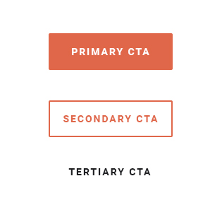
Equally important, apply a consistent visual style to your CTAs, this will help establish a pattern for users. Rank your customers’ desired actions by priority and assign a visual aesthetic for each – primary, secondary, tertiary.
Lastly, use brief but descriptive, actionable text that motivates your audience. For example, “Book a Demo” is more specific than “Learn More” and gives users a better idea of what to expect.
Key Takeaway: CTA’s should look clickable (usually a button) and should be easy to find.
Ask yourself these questions and determine where the weak spots are in your site that aren't turning traffic into conversions. Figure out which of these areas can be improved and start implementing these changes and generating leads.
That was the challenge when HDF approached our team to create a video for its Annual Breakfast. The goal was not…
The Naismith Basketball Hall of Fame is the sport's most prestigious institution — a destination that celebrates…
How do you show the full impact of care in just a few seconds? That was the challenge with Wheeler Health.…